Per-field options Link to this section
Each field can be tailored to fit your form.
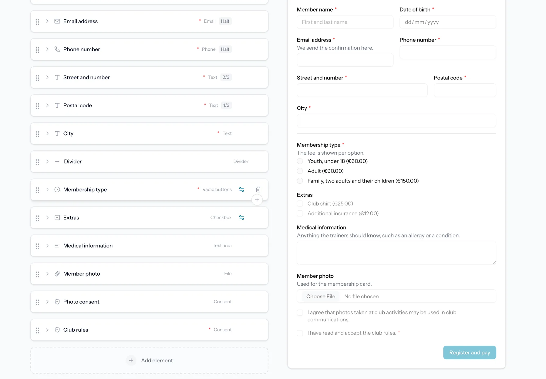
- Label and help text to explain what you are asking.
- Required toggle to make an answer mandatory.
- Placeholder text inside the field.
- Width, so fields can sit side by side.
A label is the one thing a field cannot go without, and it is the easiest one to forget on a field you just added. An empty label box is therefore outlined in orange while you are building, and in red if a save is refused over it.
A field you have set up can be duplicated instead of built again. The copy lands right under the original with all of its settings, options and conditions, and gets a number behind its label ("Menu" becomes "Menu 2"), so you only have to rename it and adjust what differs. Layout items and the fields inside a repeater can be duplicated the same way.
Select, radio and checkbox fields share the same option list. Drag an option by the handle on its left to move it up or down: respondents read the options in the order you set here, so you can reorder a list without retyping it.
A list you already have somewhere else does not have to be retyped either. Paste it into an option and every line becomes its own option, so a column of names copied from a spreadsheet lands as a finished list. Cells copied side by side across a row work the same way.
A dropdown with a long list can be searched. Turn on "Let respondents search the options" in the field settings and respondents type to narrow the list instead of scrolling it. The answer that gets stored is the same either way, so pricing, caps per option, conditions and exports are unaffected, and you can switch it on or off on a live form.
Formatting text blocks Link to this section
A text block can carry bold, italic and links. Select a piece of text and use the buttons above the field, or type the markers yourself: `**bold**`, `*italic*` and `[the words you see](https://example.com)`. The preview beside the editor shows the result as respondents will read it.
The help text under a question takes the same three marks. There are no buttons there, since it is a single line: type `**bold**`, `*italic*` or `[the words you see](https://example.com)` into the box, and the preview beside the editor shows what respondents get. It is the shortest way to put a link to your terms or your price list right under the question it belongs to.
Text blocks and help texts
Formatting applies to text blocks and to the help text under a question. A heading is already styled, and a field label stays plain so a question always reads as a question. Links open in a new tab and only http and https addresses become links.
To show an asterisk or a square bracket as itself, put a backslash in front of it: `5 \* 3`. Everything else, including `#`, `-`, `>` and underscores, is ordinary text and needs nothing. Line breaks work exactly as they always did: press Enter and the next line starts on a new line.
Conditional visibility Link to this section
Show or hide a field based on the answer to another field. For example, only show a "Which size?" field when someone selects "Yes, I want a shirt".
Conditions support operators such as equals, does not equal, is empty and is not empty.
A question with options adds "is one of" and "is none of". Tick as many options as you like and the rule holds for any of them, so "bronze, silver or gold" is one rule instead of three copies of the same block, and a fourth option can carry a different one. On a question where several options can be ticked, one selected option that is on the list is enough.
The blocks of your thank-you page take the same condition. Give a heading, paragraph, image or video a rule and only the respondents whose answers meet it get to read it, so one thank-you page can say something different to members than to everyone else. The condition is set on the block itself, in the Thank you tab, and points at a question on your form.
A block without an answer stays hidden
A conditional block is only shown when there are answers to test it against. Someone who reopens the thank-you page much later, or who lands on it without having just submitted, sees the unconditional blocks only. The same goes for a waiting-list entry: it answers the waiting-list questions, so a condition on a question from the regular form has nothing to match.
Form branding Link to this section
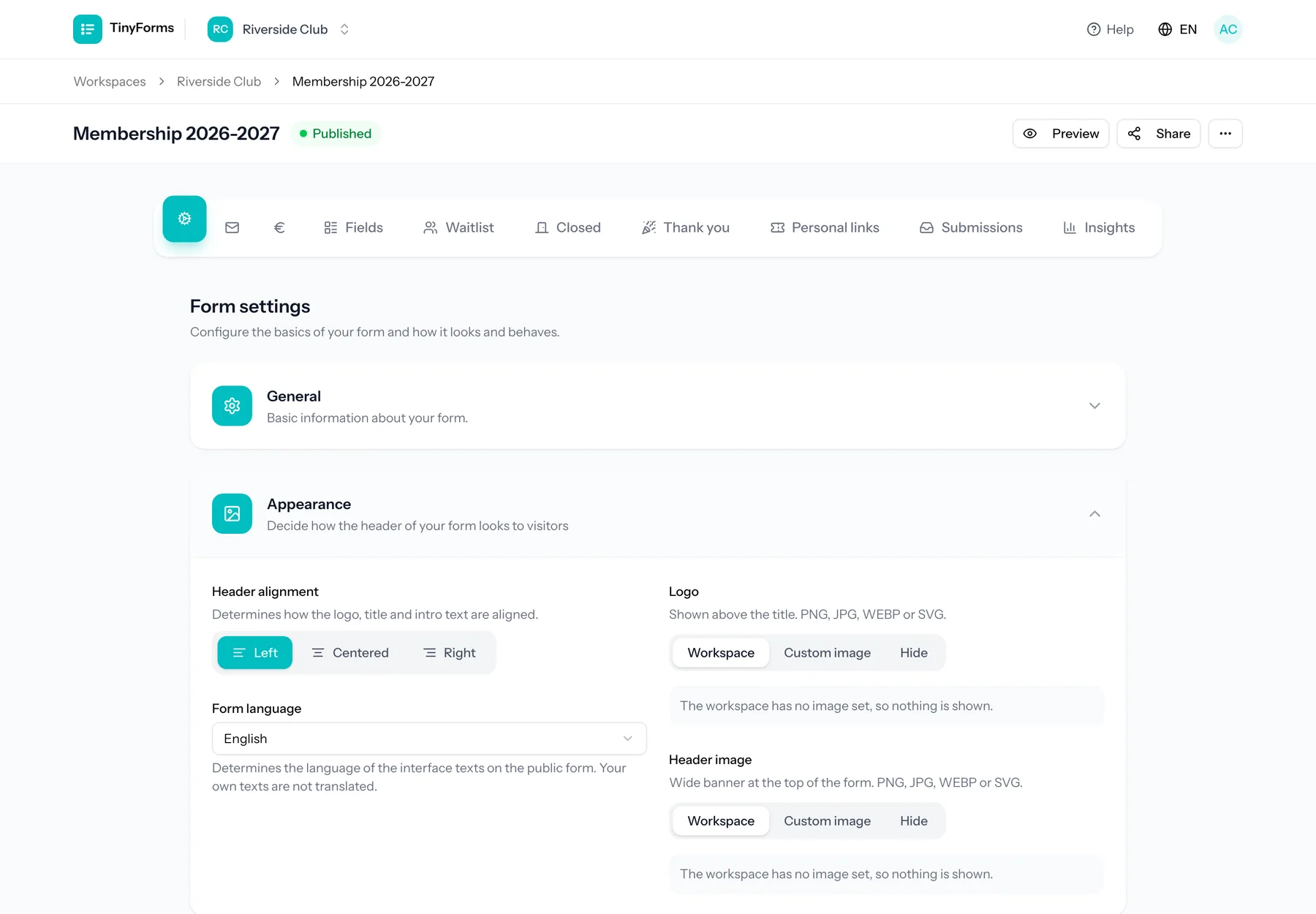
Make each form your own. You can set a logo and header image to inherit from the workspace, override with form-specific images, or hide them. A form can use its own brand colour or inherit the workspace colour.
The logo, header image and title travel with the form: they are shown on the thank-you page after submitting, and on the notices for a form that is closed, not open yet or already answered.
- Custom title, description and submit button label.
- Header alignment.
- Submit button alignment: left, centered or right. On a phone the button always spans the full width.
- Form-specific brand colour or inherit from the workspace.
Comparing more than equals Link to this section
A condition compares an earlier answer against a value. Besides "is equal to", "is not equal to", "is empty" and "is filled in", the comparisons on offer depend on what the question collects.
- Text, long text, email, telephone, URL and IBAN questions offer "contains" and "does not contain". Matching ignores capitals.
- Number, slider and rating questions offer "is greater than" and "is less than", so you can show an extra question only when someone books for more than four people.
A dropdown, radio group or checkbox is picked from a list rather than typed, so it keeps the four basic comparisons. Pointing a condition at another question drops a comparison that question cannot answer, rather than leaving a rule that could never come true.